by Sarah Felippe
Graduate Urban Design Student at SCAD
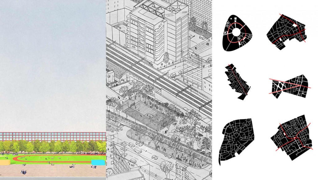
A critical exercise for any designer is the study of representation beyond its simplistic aspect of turning drawings into appealing pieces of art. We choose different representation techniques not only because of their visual impact, but because they are the visual content of an architectural speech and the architect’s own worldview. Taking the examples of three offices- Atelier Bow Wow, Dogma and Bjarke Ingels Group (BIG) – we can see how the way they represent their projects suggests the ways they understand cities.
BIG’s well known practice of explaining every concept with a sequence of self-explanatory diagrams and infographics – a practice borrowed from Ingel’s alma mater, the Office of Metropolitan Architecture that has influenced student work worldwide and can be observed in many architectural boards – satisfies in selling an idea. BIG is successful with this technique, but its continuous use becomes a trope that easily, in absence of critical thinking, avoids the complexity of an urban context or architectural program and reduces it to the simplistic symbolism of a diagram. Each architect or office must determine its own practice, but, as a close analysis of BIG’s Europa City project reveals, the excessive use of diagrams falls into the mistake of understanding cities as a collage of different functions, connected by a transportation axis. Cities go beyond diagrams, and BIG may argue that Europa City is not a random overlapping of functions and programs, but that is what their diagrams show.
Atelier Bow Wow’s famous perspective drawings, here illustrated in the Miyashita Park project, have a different representation approach, almost resembling “Where’s Waldo?”, where the complexity of urban context is illustrated with a multiplicity of activities happening, people walking in all directions and performing different actions. And exactly because of this apparent chaotic environment, the eye is not driven to a particular focal point, and it is the viewer’s job to decide where to look, and therefore, how to look to cities. The beauty of those drawings is exactly the creation of a multiple storytelling, in which your own eyes guide you. It is a technique that although may seem confusing for our lazy brains, accustomed to absorbing images without processing them, is a very powerful example of representing with one single picture many different aspects of urban life.
Dogma also developed a very unique technique; to start, the projects on their website are presented in a continuous slideshow, as if they were connected by the same principle, and, more importantly, the understanding of one is not possible without the other. If plans and isometric perspectives are always black and white and use mainly linework, it is because their intent is to observe spatial organization and insertion in urban context; drawings of the front views (vertical plan) are predominantly one-point perspectives that emphasize the relationship of the built form with landscape. Not by chance in their front view representations, paintings if you will, the view of the sky, as if one was standing at street level, prevails over everything else. This type of representation is by no means accidental, it is a rigorous choice to show the office’s continuity of speech about architecture and the city.
Those three examples show that the way we represent cities highly influences the way we think of cities, and no matter how hard we try to make them realistic and comprehensive, representation will always lack something – the lack of truth. The question though is not if we should put so much effort in making hyper-realistic representations of projects that do not yet exist, because it should already be understood by architects and other designers that realistic renderings only fulfill commercial wishes and not much more. The art of applying material, lighting and placing jumping people all over can make your project more desirable maybe to an investor, but we should be able to differentiate imagery for commercial appeal from imagery that helps us to understand and solve the technical resolution that urban design requires. One thing is to have a goal, an idea, a proposal investigated through built form and using different representation techniques to accomplish these goals; the other is to confuse design with representation itself. Representation is a tool that can add glamour to a project, but as a primordial condition it should be a tool that informs your project and adds content to it.
(SCAD School of Building Arts is proud to have our students appear as guest bloggers. Visit our site often to see what our students are thinking about!)

